Consistency is Key
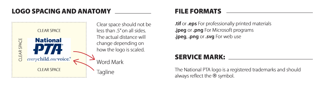
PTA has established guidelines for the proper use of the PTA name, logos, and tagline (everychild.onevoice). When used properly, PTA’s logo and tagline create a consistent message, help to unify all PTAs, and set PTA apart from the competition.
The success of our PTA brand identity system depends on all PTAs’ adherence to the established guidelines. The following guidelines are provided to establish a uniform, effective system for PTAs to use in order to maintain a consistent, visual style and brand identity for all PTA-produced materials.
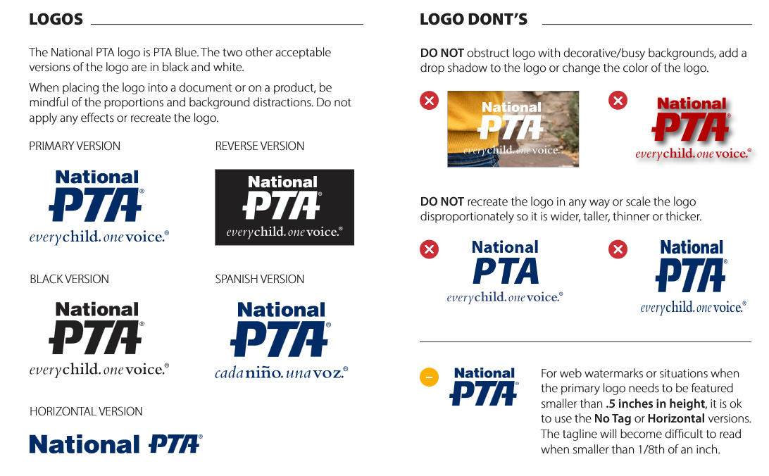
Logos
- always use official logo
- don’t stretch
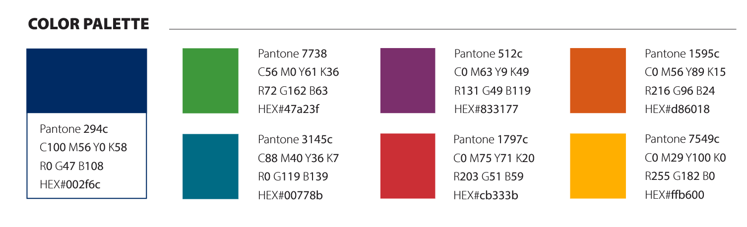
- Don’t use other colors other than black, white or PTA blue
- Saving as PNG with a transparent background allows you to put on anything without the “White box”
- Use PTA blue, black or white
You can make your own @ https://www.pta.org/home/run-your-pta/PTA-Branding-and-Web-Guidelines
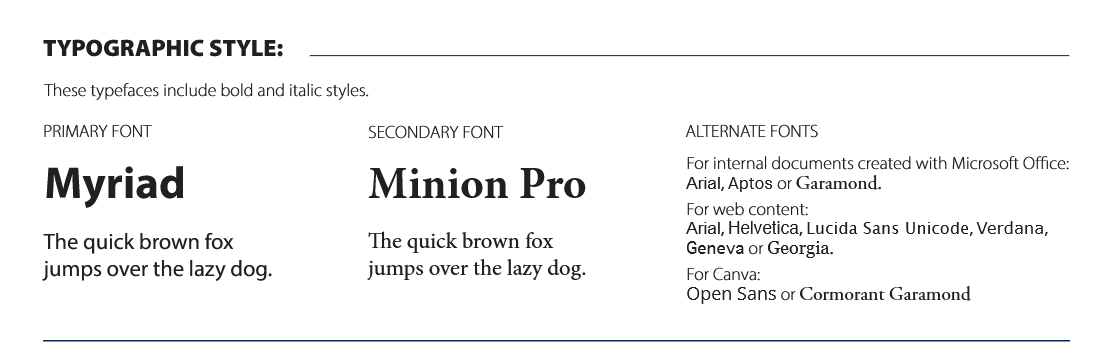
Typography (the font)
Typography can change the entire look and feel of a presentation, which is why we decided to provide five reasons why typography is so important.
- It attracts and holds the audience's attention
- It is reader friendly
- It establishes an information hierarchy
- It helps to create harmony
- It creates and builds recognition
Here are some of the standard font types National PTA suggests...
Get Help from National PTA
National PTA has excellent resources on how to best brand your PTA.
Visit their BRANDING PAGE for more ideas and information.